Build the weekly marketing update that writes itself.
You'll start with a spreadsheet of B2B SaaS marketing data and end the hour with a tool that builds your dashboard, finds anomalies, drafts the stakeholder email, and pushes it all to a Slides deck — on brand, in your voice, with one click.
The shape of the sessionWhat you'll do, when
~2 hours 10 minutes total. Don't try to climb every rung — most people get to rung 3 or 4 in the hour of build time, which is already remarkable. Pick the rungs that solve your Friday afternoon.
Section 1Setup, in three steps
Three steps. The slowest is the API key. From clicking the template link to a working dashboard is about five minutes.
Get a Gemini API key
Open AI Studio, click Create API key, copy the key. Free tier is plenty for the hour.
aistudio.google.com/apikey ↗Open the template, click Make a copy
One link. The template comes with the dataset, the bound Apps Script, and the Marketing engine menu already wired up. Google opens the "Copy document?" dialog for you — click Make a copy and it lands in your Drive.
Open the template ↗What's in your copy: a Data tab with 60 rows of B2B SaaS marketing data (12 weeks × 5 channels × 4 metrics — sessions, signups, MQLs, demos), three patterns hidden inside (two loud, one quiet), and the starter script that builds a basic dashboard and an AI weekly summary from it.
Save the API key as a Script Property
In your copied Sheet, open Extensions → Apps Script. In the script editor, click the gear icon (Project Settings) on the left rail, scroll down to Script Properties, click Add script property.
- Name:
GEMINI_API_KEY - Value: paste your AI Studio key
Save. Reload the Sheet. The Marketing engine menu appears next to Help.
Section 2Your first two clicks
Before you climb anywhere, get the bare-bones working. These two menu items prove your Gemini wiring is alive.
Build basic dashboard
Marketing engine → Build basic dashboard. A new Dashboard tab appears with a chart of total sessions per week.
Generate weekly summary
Marketing engine → Generate weekly summary. A Summary tab appears with 4–6 bullets written by Gemini. This is your foothold for everything else.
When things go wrong
Quick reference. The four most common stumbles in the first 10 minutes:
| What you see | What it usually means |
|---|---|
| No Marketing engine menu after reloading | The script wasn't pasted, or the Sheet wasn't reloaded. Check the Apps Script editor has your code, then reload the Sheet (Cmd-R / Ctrl-R). |
Cell shows API 401 or API 400 | The GEMINI_API_KEY Script Property is missing or misspelled. Project Settings → Script Properties — the name is case sensitive (exactly GEMINI_API_KEY). |
| "No 'Data' tab" alert | The imported tab is named something else. Right-click the tab → Rename → make it exactly Data (capital D, no trailing space). |
| Permissions dialog looks scary | Normal. Click Advanced → Go to project (unsafe) → Allow. You're authorising your own script to talk to your own Sheet. |
Section 3Before you climb
Two minutes that pay back across every rung. You'll set up a re-usable data context block, and learn the prompting pattern we'll use the whole way up.
The pattern
Every ladder prompt has the same shape: your current code, your data context, what you want, and how Gemini should respond. Once you generate the data context once, you'll paste it into every prompt for the rest of the hour.
Two prompting surfaces to know about:
- Sheets Gemini side panel (the ✨ icon top right of your Sheet) — has your data automatically. Use it for "describe my data" or "what's in this Sheet" questions.
- Gemini Canvas (gemini.google.com → Canvas) — better for "write me Apps Script code" requests. You can iterate on the same artifact, see code update inline, and copy clean blocks straight to your
Code.gs. (If you've got access to Gemini Agent Mode, use that instead — even better for multi-step build prompts.)
Step 1 — Get your data context
Open your copied Sheet. Click the ✨ Gemini icon (top right) to open the side panel. Paste this prompt:
You're looking at my Sheet directly. Help me understand it.
Tell me:
1. What columns we have, with the data type of each (date, text, integer, etc.)
2. The shape of the data — how many rows, how many distinct values per categorical column
3. Three sample rows that span the time range
4. Anything you'd flag as unusual at first glance
Format your reply as a clean "Context:" block I can paste into other prompts. No commentary outside that block.Gemini will reply with a Context: block summarising your schema, sample rows, and any patterns it spots. Keep that chat open. If you're using Gemini Canvas (recommended), it'll remember the data context for the rest of your session — every ladder prompt below builds on it. No need to re-paste each time.
Step 2 — Set your project context (run once)
Open Gemini Canvas, paste this one prompt, and send. It tells Gemini what you're building, what your data looks like, and what code you already have. Canvas remembers all of it for the rest of the chat — every ladder prompt below builds on this. Don't run it twice; don't paste your code again later.
I'm building a Google Apps Script project this hour. Once I send this, you'll have everything you need — I won't paste this again.
== PROJECT ==
This is a Google Apps Script project, bound to a Google Sheet.
== AUDIENCE ==
I'm a marketing professional. I'm using this to report on my marketing data each week.
== MY DATA ==
[paste the Context: block you generated in Step 1]
== MY CURRENT CODE.GS ==
[copy/paste your Code.gs from the Apps Script editor]
Acknowledge you've got the context and wait for my next instruction before changing anything.
Section 4The upgrade ladder
Eight rungs. Pick whichever fit your Friday-afternoon pain. Each one has a Gemini prompt template you can paste straight into Gemini Canvas (or Agent Mode) to get the code.
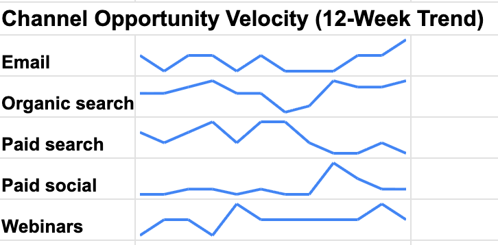
Make it yours: Sessions stacked by channel is the obvious chart. What does your CMO actually look at first? Edit the question before you ask it.
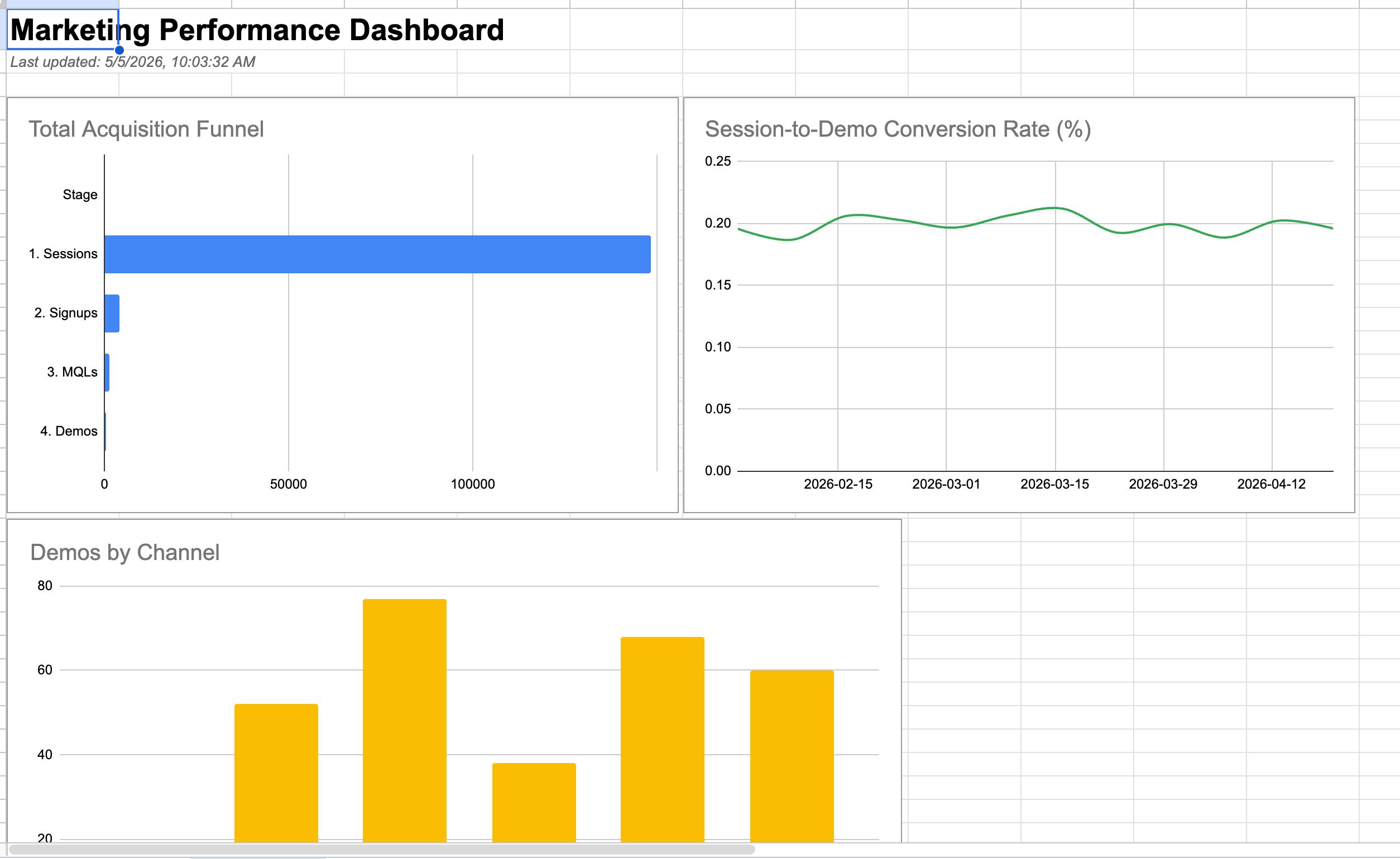
The starter drew one chart of total sessions per week. The next obvious move is to break that down by channel — but it's not the only move. Funnel charts (sessions → demos), conversion-rate trend lines, channel-comparison bars all answer different questions. Pick the question that matters most.
The more specific you can be about what the chart should answer, the better the result. "Stacked sessions by channel, weeks on the x-axis, paid channels on top of organic" beats "make a sessions chart" every time. If you've got a chart your CMO already loves, describe it instead of inventing a new one.
Not a prompt — a few ways you could push this further than the cookie-cutter version.
- Don't default to stacked sessions by channel. What does your CMO actually scan first? A funnel ending in demos? A conversion-rate trendline? Lead with the question, not the chart.
- If your team already loves a chart, describe it to Gemini precisely — "bar chart, paid on top of organic, weeks on x-axis, slanted labels" beats "make a sessions chart."
- Two small charts often beat one big one. Try a paid-vs-organic comparison next to a funnel chart.
- Match the chart to the audience. Conversion rates land with sales. Funnel shapes land with demand-gen. Spend efficiency lands with finance.
A copy-paste-ready ask. Drop it into Gemini Canvas — it already has your data context and code from earlier turns.
== WHAT I WANT ==
Add a new chart to my Dashboard tab. I want a stacked column chart showing sessions per week, broken down by channel — paid search, paid social, organic, email, webinars stacked on top of each other.
Put it underneath the chart that's already there so they don't overlap. Make sure the week labels are easy to read — slant them if you have to. Keep it the same kind of size as the chart that's already there.
Update the Apps Script code.
Make it yours: The default summary writes for "your team." Whose voice does your team actually use? What words do they hate?
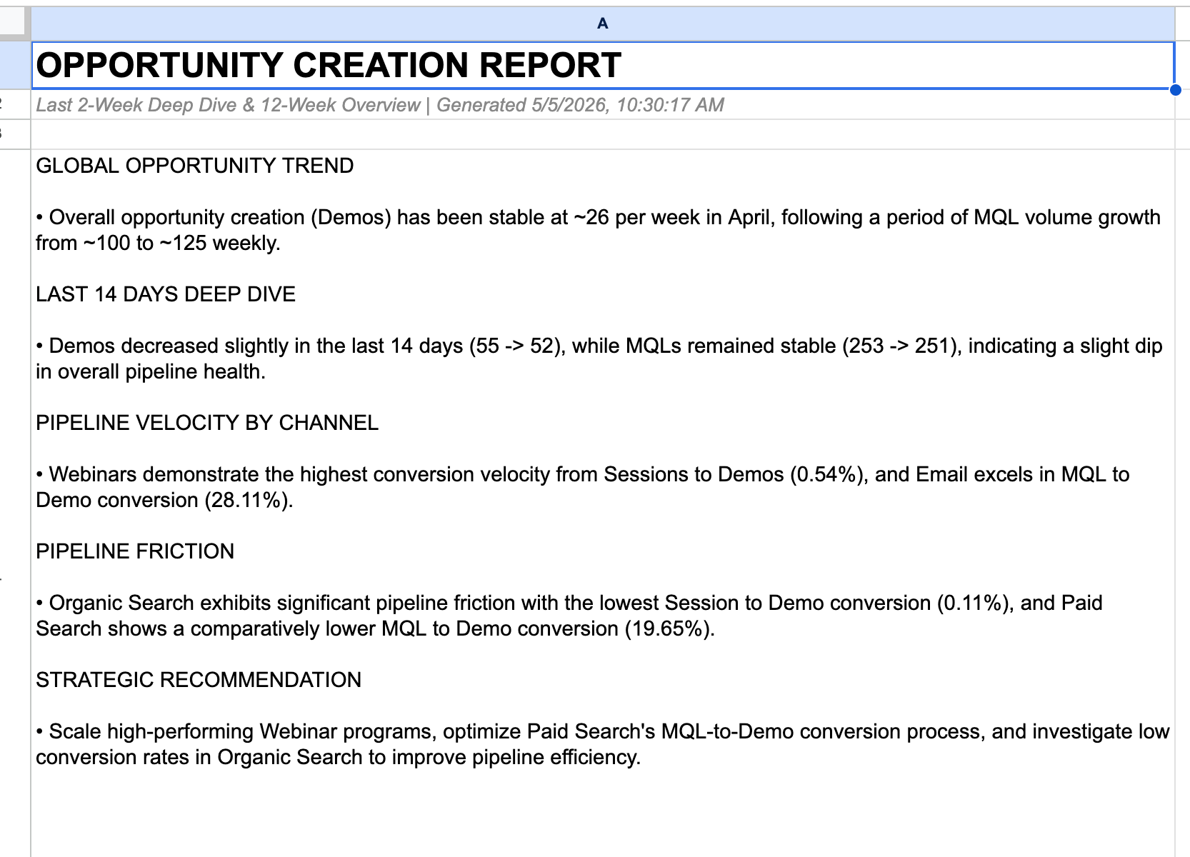
The starter passes all 60 rows to Gemini and asks for 4-6 bullets. Verbose, generic, doesn't sound like your team. The smart version: pass less data (latest two weeks only), ask for named sections, and bake your team's voice into the prompt.
The big design choice is which sections matter. "What changed" is universal. "Recommended next step" might be redundant if your CMO already has next-step instincts. Adapt the structure to your team.
Not a prompt — a few ways you could push this further than the cookie-cutter version.
- Whose voice does your team actually use? Punchy? Dry? Technical? Bake those rules into the prompt — banned-words lists work surprisingly well (no "leverage," "synergy," "unlock," "supercharge").
- Pick which sections matter. What changed is universal. Recommended next step might be redundant if your CMO already has next-step instincts.
- Try giving Gemini only the latest two weeks of data instead of all 12. Sharper takeaways, less waffle.
- Ask for "say what you don't know." If a number moved and the data doesn't explain why, the AI should say "we don't know yet" instead of inventing a reason.
A copy-paste-ready ask. Drop it into Gemini Canvas — it already has your data context and code from earlier turns.
== WHAT I WANT ==
Make my weekly summary sharper.
Look at just the latest two weeks of data instead of all 12. Add up the totals across all channels for each of those two weeks so they're easy to compare.
Then write a short update for my team and put it on the Summary tab. Format it as plain text that reads cleanly inside a single cell — no Markdown headings, no asterisks for bold, no special bullet characters. Use ALL-CAPS section headings on their own line with plain text underneath, and a hyphen + space for bullets.
The sections, in order:
HEADLINE — one sentence
WHAT CHANGED — three or four short bullets with specific numbers
WHAT STANDS OUT — anything unusual
NEXT STEP — one concrete action
Voice rules: plain language, no jargon. Banned words: leverage, synergy, unlock, supercharge, seamless, world-class. Be specific with numbers — say "+23%" not "up significantly". Don't make up causes — describe what changed without inventing reasons.
Update the Apps Script code.
Make it yours: The basic flagger catches the obvious dips and spikes. What's the quiet thing that's been bugging your team for weeks? Tell Gemini to look for that one too.
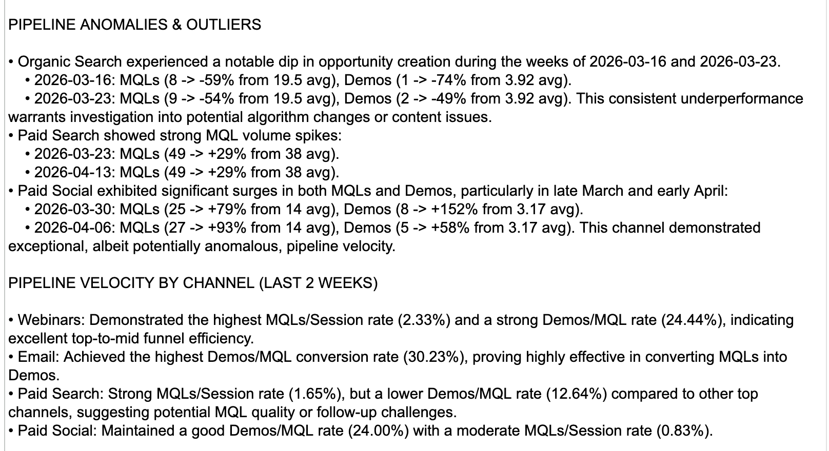
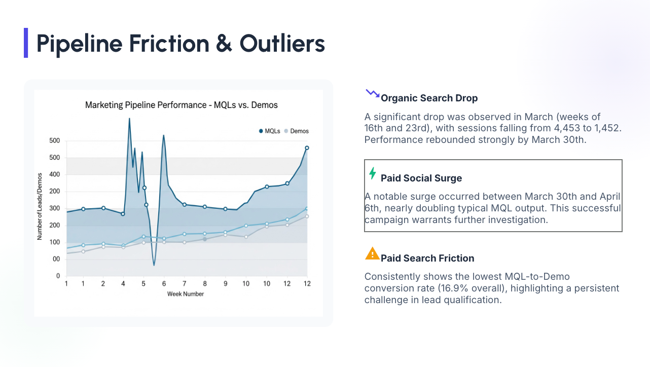
The dataset has three patterns. Two are loud — any reasonable "flag the weeks that look weird" check finds them. One is quiet (a drift in conversion rates in Paid search) — the simple version will miss it.
One thing worth thinking about: should it flag big swings in raw numbers (sessions, demos), or shifts in conversion rates between funnel stages? Conversion-rate flags catch the sneakier patterns. You can ask Gemini for both.
Not a prompt — a few ways you could push this further than the cookie-cutter version.
- The basic flagger catches loud anomalies. The quiet ones (slow conversion drift, gradual decline) need a sharper test — try flagging shifts in conversion ratios, not raw values.
- Big positive spikes are anomalies too — and they're often the most interesting. Where did that traffic come from? Make sure your flagger catches them, not just the dips.
- Have Gemini write each explanation in your team's voice. "Paid search dropped because…" lands better than "Paid search experienced a deviation."
- Pull in seasonality. Compare a week to the same week last quarter, not just the last four weeks. A January week looks weird against a December baseline for a reason.
A copy-paste-ready ask. Drop it into Gemini Canvas — it already has your data context and code from earlier turns.
== WHAT I WANT ==
I want to spot weeks where something looks off compared to the recent past.
For each channel and metric, compare each week to the four weeks before it. If a week is clearly different — roughly twice the normal variation away from those four weeks — flag it. Skip the first four weeks since there's no history yet to compare against.
Then for each flagged week, write a single short sentence describing what changed, in what direction, and by how much. Keep it factual — don't speculate about causes, just describe the move.
Show the flagged weeks on a new tab called Flagged. Most recent first, biggest moves at the top of each week.
Update the Apps Script code.
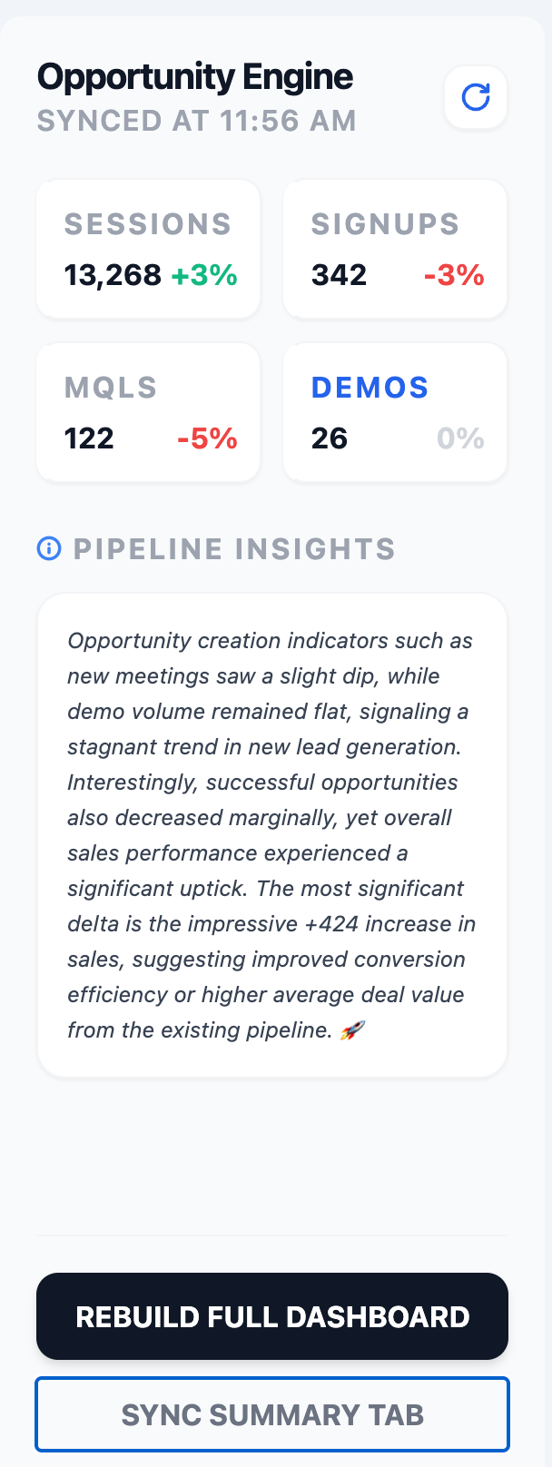
Make it yours: The default sidebar shows your summary, your anomaly flags, and a Refresh button. What else would your team actually want one click away — a "send to Slack" button? A channel filter? Last week's recap pinned to the top?
Right now your weekly summary lives on the Summary tab and your anomaly flags live in whatever tab rung 3 put them. That works, but it's two tabs to remember. A sidebar is a small HTML panel that opens from a menu item and shows both at once — plus a Refresh button so you can re-run the analysis without leaving the Sheet.
This is also where the engine starts to feel like a real product, not a script. Once you've got a sidebar, you'll start thinking about what other one-click things belong in it.
Code.gs, and a separate HTML file (e.g. Sidebar.html). HTML can't live inside Code.gs — it needs its own file in the Apps Script project.
To add it: in the Apps Script editor, click the + next to Files in the left sidebar → choose HTML → name it whatever Gemini called it (without the .html — Apps Script adds that itself). Paste in the HTML Gemini gave you and save. You'll now see two files in the panel: Code.gs and your sidebar's HTML — that's normal. From now on, sidebar tweaks happen in the HTML file; logic tweaks happen in Code.gs.
Not a prompt — a few ways you could push this further than the cookie-cutter version.
- Default sidebar = summary + flags + Refresh. What ELSE belongs one click away? A Send to Slack button? A channel filter dropdown?
- Pin last week's recap at the top so you can compare week to week without leaving the panel.
- Add a quick-question text box. Type a question, hit Ask, get an instant Gemini answer with this week's data already attached.
- Quick-action buttons turn the sidebar from a viewer into a tool: Email this to my CMO, Post to #marketing, Save this insight to a Decisions tab.
A copy-paste-ready ask. Drop it into Gemini Canvas — it already has your data context and code from earlier turns.
== WHAT I WANT ==
Add a sidebar to my Sheet that surfaces this week's insights in one panel.
When I click a menu item, a sidebar should slide in from the right and show:
- This week's AI summary at the top
- Each flagged anomaly listed underneath, with the channel, what changed, and the short AI explanation
- A Refresh button at the bottom that re-runs the analysis without making me leave the Sheet
Visual style: calm and simple. Small font, plenty of whitespace, no loud colours. It should feel like part of the existing dashboard, not a different app.
Add an "Insights" item to the Marketing engine menu that opens the sidebar.
Heads up: this'll mean two files — my Code.gs gets new functions, and you'll give me a separate HTML file for the sidebar. Tell me what to call the HTML file and I'll add it in the Apps Script editor myself.
Update the Apps Script code.
Make it yours: Sparklines of Sessions are the default. Which metric matters most to YOU? It's probably not sessions.
Sparklines are tiny line charts that live in single cells via =SPARKLINE(range, options). Cheap, dense, glance-able. They complement the big chart — let you see all 5 channels' shapes at once without taking up half the screen.
The design choice: which metric do you sparkline? Sessions (the obvious one), conversion rate (the interesting one), demos (the bottom-of-funnel one). Different choices tell different stories.
Not a prompt — a few ways you could push this further than the cookie-cutter version.
- Sparkline of sessions is the obvious one. What metric matters more to YOU? Conversion rate? Demos? A composite quality score?
- Colour-code the WoW%: green if positive, red if negative, slate if flat. Much faster to scan a 5-row table that way.
- Pair sparklines with their delta. A sparkline alone is pretty; a sparkline plus "+12% WoW" is useful.
- Tiny per-channel funnels (sessions → signups → demos) tell a different story than a single-metric line. Try one per channel as a row.
A copy-paste-ready ask. Drop it into Gemini Canvas — it already has your data context and code from earlier turns.
== WHAT I WANT ==
Add a per-channel summary table to my Dashboard tab.
One row per channel. Columns I want, in order:
- Channel name
- This week's sessions
- Last week's sessions
- Week-over-week % change (green if it went up, red if it went down)
- A tiny trend line showing the last 12 weeks of sessions, all inside one cell
Put it underneath any charts that are already on the Dashboard so it doesn't overlap.
Update the Apps Script code.
Make it yours: Who's going to read the email? Your CMO? Your CFO? Your team? Voice changes for each one. Edit before you draft.
Apps Script can drop a draft straight into your Gmail inbox in one call. That part is easy — Gemini will figure it out. The interesting part is the email itself.
Ask Gemini for an HTML email, not plain text. A nicely-styled email — heading, sections, a small metrics table, a bit of colour — reads like a deliberate update. A wall of plain text reads like an export.
You drive the narrative — don't dump everything. The temptation is to stuff every metric, every anomaly, the full summary, and a footer into one email. Don't. Decide who's reading and what they need to know in 30 seconds. The CMO might want a one-line headline + one chart. The whole team might want a bullet list of what changed. The CFO might want money and conversion rates first. Tell Gemini the audience and the structure you want — that constraint is what makes the email feel like yours, not generic AI output.
You may also want to ask Gemini for different insights for the email than what's on the Summary tab — shorter, punchier, audience-specific. The Sheet's summary is for you. The email is for them.
Not a prompt — a few ways you could push this further than the cookie-cutter version.
- Drive the narrative — don't dump everything. Pick the three things your audience needs in 30 seconds. The rest is noise.
- Different audiences need different emails. CMO = headline + one chart. CFO = numbers and conversion rates first. Whole team = bullets of what changed. Decide who's reading before you write the prompt.
- Generate fresh AI prose for the email — shorter, sharper, audience-specific — instead of reusing the longer Summary tab text.
- Add a "weekly question" line to spark replies. "Why did Paid social drop 18%? Anyone seeing this in your campaigns?" turns a one-way email into a thread.
A copy-paste-ready ask. Drop it into Gemini Canvas — it already has your data context and code from earlier turns.
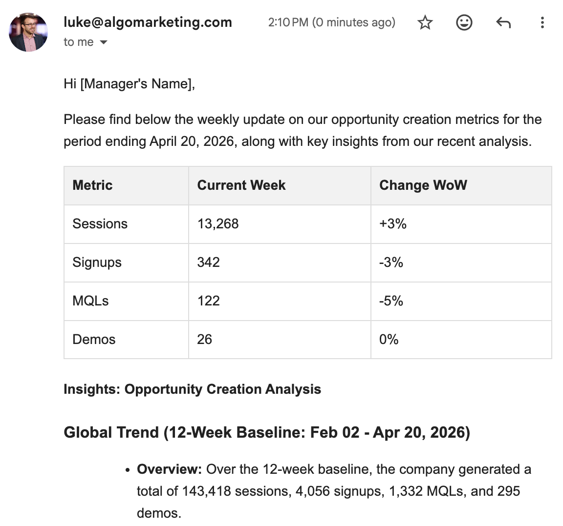
== WHAT I WANT ==
Drop a polished HTML email into my Gmail drafts each time I run this.
Audience: my CMO. They'll spend 30 seconds on it. Every line has to earn its place.
Send it to my own email address.
Subject: "Marketing weekly — <the latest week date>".
The email itself should be a nicely-formatted HTML email — clear heading, sections, a small metrics table, comfortable spacing. Make it feel intentional and on-brand, not auto-generated. Calm colour palette.
What goes in it, in order:
1. A one-sentence headline naming the most important thing that changed
2. Three short bullets of what changed this week — specific numbers, not adjectives
3. A small table with this week's totals and the week-over-week % change for sessions, signups, MQLs, demos
4. One concrete next step
5. A footer link saying "Open the full dashboard" that links to my Sheet
Don't reuse the long Summary-tab text — generate fresh, sharper prose for the email itself. Punchy, stakeholder-ready.
Drop it in as a draft (don't send) and give me the link so I can review and click Send myself.
Update the Apps Script code.
Make it yours: Decks are read by people who skipped the meeting. What's the one slide they need? Lead with that.
Apps Script can spin up a brand-new Google Slides deck and fill it for you. The simplest version: ask Gemini to create the deck from scratch — title, summary, charts from your Dashboard tab, AI speaker notes, done. That's the path to take in the hour.
Heads up — the deck you get will look pretty rough. Default Slides theme, default fonts, charts dropped in at default sizes. It works for an internal "here's where we are" readout, but it won't look like something a designer touched. That's fine for the hackathon — the point is proving the engine can produce a deck on demand.
Design choice: how many slides? A 3-slide deck reads in 60 seconds. A 15-slide deck takes 15 minutes to present. Match the deck to the meeting it's going into.
Build a Slides template once with your branding, your fonts, your slide layouts — then sprinkle {{Pipeline Change}}, {{Visits This Month}}, {{Top Anomaly}} placeholders into the slides where data should land. Each week, your script clones the template, asks Gemini for the values, and replaces the placeholders. The deck looks identical to one a designer made — because a designer made the template — and the data fills itself in. Skip this for today; come back to it when you want the engine to feel polished.
Gemini itself can now generate Slides decks and PDFs directly from a Canvas chat — no Apps Script needed. Paste your weekly numbers, ask for a 5-slide readout, and it builds the deck for you. Worth knowing about: for one-off decks where you don't need automation, that's often the faster path. Apps Script is the right call when you want this to happen every week, on a schedule, without you in the loop.
Not a prompt — a few ways you could push this further than the cookie-cutter version.
- Three slides beats fifteen. What's the one thing leadership needs to know? Build that one slide first — everything else is optional.
- Use a template deck with
{{variables}}. Build a branded deck once with placeholders like{{Pipeline Change}}and{{Top Anomaly}}, then have your script clone it each week and let Gemini fill in the values. Looks designer-made because a designer made the template. - Embed Dashboard charts live-linked so the deck stays current when the Sheet updates. No re-pasting.
- AI speaker notes per slide. Whoever presents it has something to say even if they didn't write the deck.
A copy-paste-ready ask. Drop it into Gemini Canvas — it already has your data context and code from earlier turns.
== WHAT I WANT ==
Build a fresh Google Slides deck for the weekly readout.
Audience: leadership. They'll click through it in 90 seconds.
Length: 5 slides max.
The slides, in order:
1. Title — "Marketing weekly readout · Week of <the latest week date>"
2. Headline — one sentence with the most important thing that changed
3. The main chart from my Dashboard tab — embedded live so it updates when the Sheet does
4. What changed — three short bullets with specific numbers
5. Recommended next step — one concrete action
Add a short AI speaker note (~50 words) under each slide so whoever presents it has something to say.
Open the deck after creating it and give me the URL.
Update the Apps Script code.
Make it yours: Friday at 4pm is the obvious cadence. What's YOUR team's actual rhythm? Tuesday at 9? End-of-month? Edit the trigger to match.
Apps Script can run any of your functions on a schedule — no server, no cron, no ops. Pick a day and time, and your dashboard rebuilds itself, the email lands in your drafts, the deck regenerates. You walk in Monday and it's all there.
The interesting question isn't how to set it up — Gemini will handle that. It's when should it run. Friday afternoon so the email's waiting for you Monday? Monday 9am so it's the first thing you see? End-of-month for the executive report? The cadence should match your team's actual rituals — not the example.
Not a prompt — a few ways you could push this further than the cookie-cutter version.
- Friday 4pm is one rhythm. Yours might be Monday 9am (so it's the first thing you see), end-of-week digest, or end-of-month executive report. Match the cadence to your team's actual rituals.
- Layer triggers. A daily anomaly check + a weekly summary + a monthly executive deck — each is a separate trigger. Different rhythms, different audiences.
- Add a "skip if no new data" guard so the email doesn't fire on a holiday week with stale numbers.
- Send yourself a tiny "engine ran successfully" Slack ping after each run. Quietest way to know the engine is healthy without checking.
A copy-paste-ready ask. Drop it into Gemini Canvas — it already has your data context and code from earlier turns.
== WHAT I WANT ==
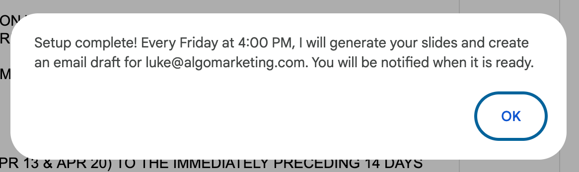
Set up the engine to run itself every Friday at 4pm.
When the schedule fires, I want it to:
- Rebuild the dashboard
- Run the anomaly check
- Refresh the AI weekly summary
- Drop a new draft email into my Gmail (don't send — leave it as a draft for me to review)
Make sure running setup again doesn't create duplicate schedules.
Add a menu item called "Set up Friday auto-run" that triggers the setup.
After each scheduled run, log a one-line note saying it succeeded or failed, so I can tell the engine is healthy.
Update the Apps Script code.
Make it yours: The eight rungs above are where I started. Your team has its own headaches. What's yours?
The point of the hour isn't to climb every rung. It's to leave with something that solves a problem your team actually has. If the ladder doesn't cover it, build it anyway — the same Gemini Canvas chat will keep up.
If you're stuck on what to build, ask Gemini to help you scope it before you ask for code:
I want to build something useful for my team this hour, but I'm not sure what.
Here's the kind of thing I find myself doing manually each week:
[describe one chore — the thing you keep copying, reformatting, chasing down]
Suggest three different things I could build to automate or accelerate that, ranked from quickest to most ambitious. For each one, tell me roughly what it would do, what I'd need to set up first, and roughly how long it'd take. Don't write any code yet.
Once you've picked the idea, it's the same shape as every other rung: tell Gemini what you want in plain English, look at what it gives back, iterate. The Sheet, the data, the API key — you've already got everything you need.
Section 5Apps Script cheat sheet
Six interfaces, what to reach for when, and the one limit that'll bite you. Skim now; come back when something doesn't quite fit.
Six interfaces — when to use which
You don't need to know the code for any of these. You need to know which one solves your problem, and what to say to Gemini to get it.
Best for: a teammate who already lives in the doc and wants a button. Lowest friction. Works in Sheets, Docs, Slides, Forms.
"Add a custom menu to my Sheet called Marketing engine with three items — Build dashboard, Generate weekly summary, Draft weekly email — each calling the function with the matching name."
Best for: a real UI — charts, forms, refresh buttons — without leaving the document. Whole HTML pages live here.
"Add a function showInsights() that opens a sidebar on the right side of my Sheet. The sidebar should show our weekly AI insights, list any flagged anomalies, and have a Refresh button that re-runs the analysis."
Best for: confirmation, configuration, multi-step setup. Blocks the document until dismissed.
"Before my draftWeeklyEmail() function runs, open a modal dialog asking the user to pick the audience — CMO, CFO, or whole team. Pass that choice into the prompt so the email voice matches."
Best for: a tool you give to people outside the doc. One Deploy click, you've got a URL — auth handled by Google.
"Walk me through deploying this Apps Script as a web app I can share. I want a URL my team can open. Start with a simple doGet() that returns one HTML page with the latest weekly summary."
Best for: when your user already thinks in cells. =ASK(...) works alongside =SUM and =VLOOKUP.
"Add an =ASK() custom function so I can write =ASK("summarise this week", A1:F61) in any cell. Keep the prompt focused — one row at a time max, since each call has a 30-second cap."
Best for: things that should happen without anyone clicking. No UI. The most hands-off interface there is.
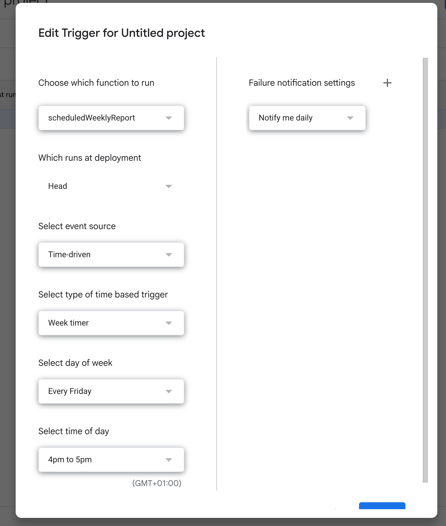
"Set up a time-driven trigger that runs buildDashboard() and draftWeeklyEmail() every Friday at 4pm. Make it idempotent — running setup twice shouldn't create duplicates."
What fits in one run
Apps Script kills any function that runs longer than 6 minutes. Custom functions used inside cells time out at 30 seconds each. Each Gemini API call takes 3–10 seconds. Most of what you'll build today fits comfortably; a few patterns won't.
| ✓ Likely to work | ✗ Likely to time out |
|---|---|
| One AI weekly summary — single Gemini call, ~5–10s | =ASK() filling 100 cells — Sheets recalcs, 100 × 5s ≈ 8 min, hits the timeout |
| Dashboard with 4 charts, no AI — instant, well under a second | Trigger that processes 200 inbox emails one at a time — sequential, will exceed 6 min |
| One Gmail draft of the weekly email — 1 AI call, ~5–10s | AI explanation per anomaly when 50 are flagged — batch them all in one prompt instead |
| 5-slide deck with chart slides + AI speaker notes — 5 AI calls, ~30–60s | One AI summary per row of a 60-row sheet — 60 × 5s = 5 min, dangerously close |
| Anomaly detection over 60 rows + AI explainers for ~5 flags — under a minute | A custom function called by hundreds of cells at once — each capped at 30s, recalc storms kill it |
=ASK() over rows, send all the rows in one prompt instead. One prompt that returns 50 lines beats 50 prompts that return one line each — every time.
Things that'll trip you up
The "unverified app" warning is normal
First time you click any menu item, Google shows a scary warning. Click Advanced → Go to project (unsafe) → Allow. It's your script asking permission to run on your doc.
Sheet name must match exactly
DATA_SHEET = 'Data' won't find a tab called data or Data (trailing space). Case sensitive, whitespace sensitive. The starter checks for this and tells you when it's wrong.
API key lives in Script Properties, never in code
Project Settings (gear) → Script Properties → Add. Name it GEMINI_API_KEY. Don't paste your key into a .gs file or a Sheet cell — it'll leak the moment you share.
Custom functions can only return primitives
Inside =ASK(...), you can return strings, numbers, or 2D arrays — not objects. If you need structured data, return JSON-stringified text and parse it where you use it.
First Gemini call is slow
5–10 seconds the first time. 2–4 seconds after that. If it's hanging longer than 30s, your key is wrong, you've hit a free-tier quota, or the API is having a moment. Check the troubleshooting card in Section 2.
onOpen builds menus but can't call APIs
Triggered onOpen runs with limited permissions — fine for adding menu items, but it can't call UrlFetchApp.fetch. Auth runs lazily on the first actual menu click. Don't try to do real work in onOpen itself.
That's it. Go build.
Last 10 minutes is for show-and-tell. Bring whatever you've got. The interesting question isn't completeness — it's what does your version do that nobody else's does?